

Appearance
The Appearance tab lets admins customise how Filed looks for the entire firm. Changes made here apply to every member of the workspace.
Who can change appearance
Every member can open the Appearance tab, but only admins can change it. For Level 1, Level 2, and Level 3 members the settings are disabled, with the note "Available for admins".
Firm logo
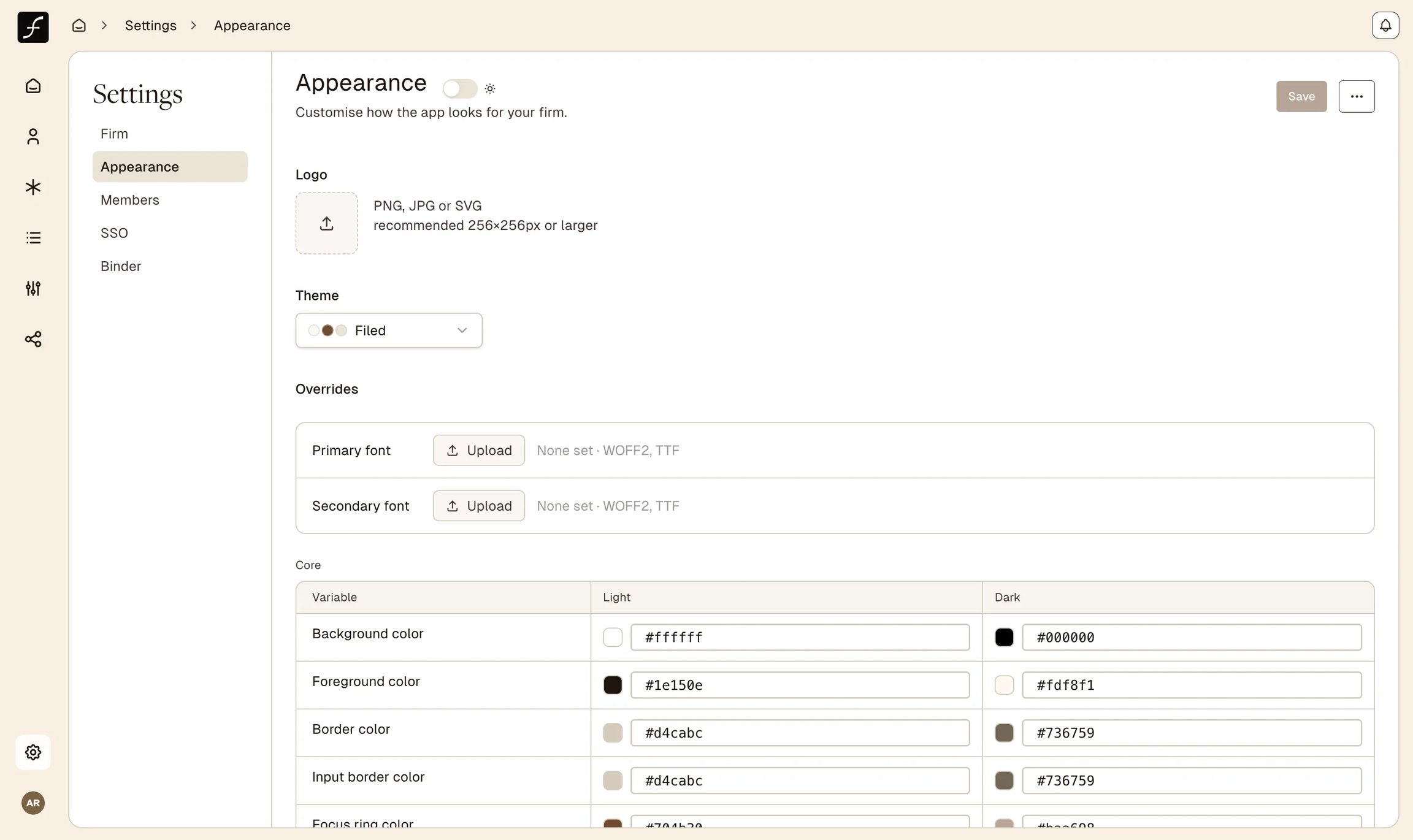
Upload a PNG, JPG, or SVG file to set the firm's logo (recommended size 256x256 px or larger). The logo appears wherever the workspace identity is displayed. Click the logo placeholder area to open a file picker; the upload begins immediately, and a preview replaces the placeholder once complete.
Theme presets
Three built-in presets are available from the Theme dropdown:
Filed
Warm espresso and cream (default)
Cream, espresso brown, warm tan
Filed B&W
Clean black and white
White, near-black, light grey
Filed 1.0
Legacy Filed blues and warm stone
White, navy blue, warm off-white
Selecting a preset immediately applies its colour values as the starting point. You can then fine-tune individual colours using the CSS variable editor below. Selecting a preset replaces any previously applied overrides.
Fonts
Under Overrides, two font upload slots are available:
Primary font - used for headings and prominent text
Secondary font - used for body and supporting text
Accepted formats are WOFF2 and TTF. Click Upload next to either slot to select a file; once uploaded, the filename is shown with a checkmark. If no custom font is set, Filed's default typefaces are used.
Colours and CSS variables
The CSS variable editor is organised into groups. Each group controls a specific aspect of the interface:
Core - background, foreground, border, input border, and focus ring colours
Primary - the main action colour and its foreground and hover states
Secondary & Muted - secondary backgrounds, muted surfaces, and accent colours
Card - card surface and card text colours
Sidebar - sidebar background, text, primary, accent, and border colours
Destructive - colour used for destructive actions and alerts
Radius - border radius values (base, XS, SM, MD, LG)
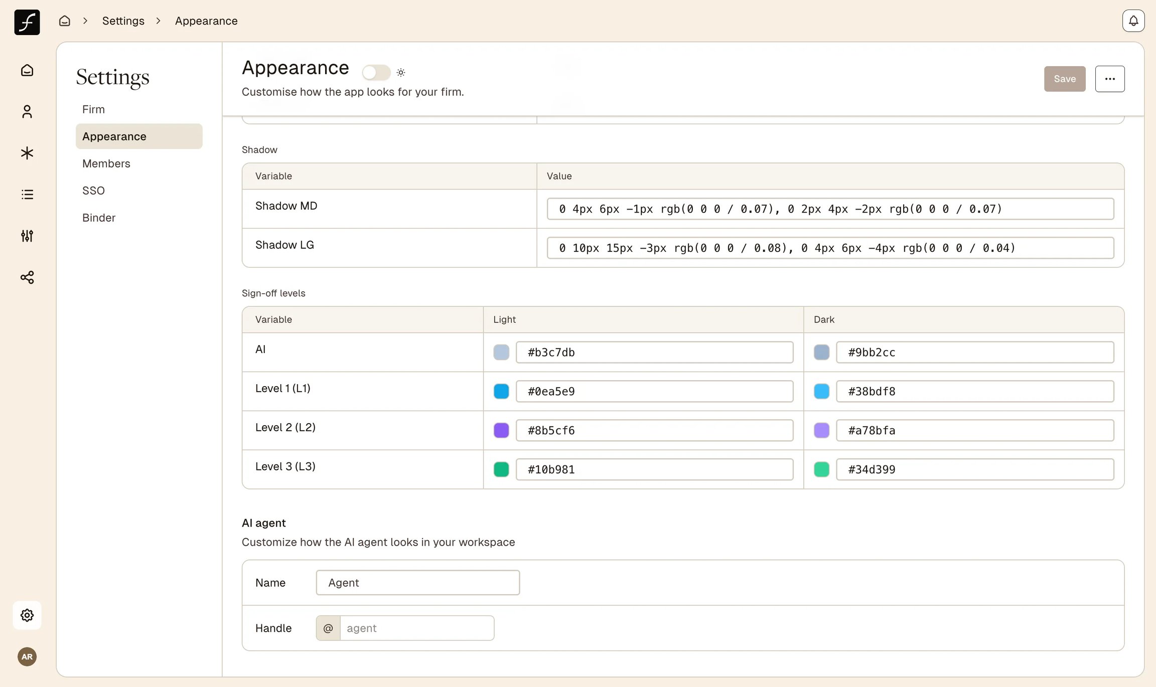
Shadow - shadow values for MD and LG elevations
Sign-off levels - distinct colours for each review stage (AI, Level 1, Level 2, Level 3)
Sign-off level colours
Each sign-off stage in a client's review workflow has its own colour token: AI, Level 1 (L1), Level 2 (L2), and Level 3 (L3). These colours appear on document-level sign-off indicators throughout the binder and review views. Setting a distinct colour per level makes it easy to see which review stage a document has reached at a glance.
Light and dark mode editing
A toggle switch in the Appearance header switches the editor between light-mode and dark-mode variable sets. Edits made in light mode only affect the light palette; edits in dark mode only affect the dark palette. The live preview updates in real time as you type colour values, so you can see the effect before saving.
AI agent persona
The AI agent section lets you set the name and handle used when the AI surfaces in comments and workflows:
Name - a display name shown in the interface (placeholder: "Agent")
Handle - a short identifier prefixed with
@, with no spaces (placeholder: "agent")
These values affect how the agent is addressed and referenced across the workspace.
Dark mode
Dark mode is a personal, per-device preference controlled by the toggle next to the Appearance heading; switching it does not affect other users' view. It determines which variable set (light or dark) is applied to your session, and also controls which set you are editing in the CSS variable editor.
Saving and resetting
A Save button sits in the sticky header bar at the top of the Appearance page and becomes active only when there are unsaved changes. Clicking it saves the logo, fonts, theme selection, colour overrides, and AI agent settings together in a single operation. A success toast confirms the save.
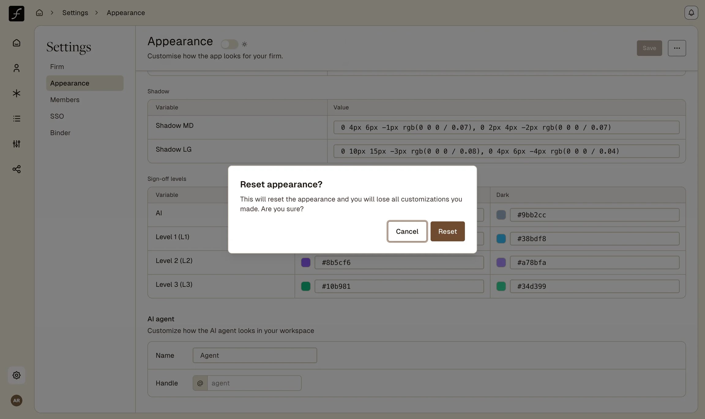
To undo all customisations, open the three-dot menu next to the Save button and select Reset to defaults, then confirm in the dialog. Resetting removes the custom logo, clears font uploads, restores the Filed preset colours, and clears the AI agent name and handle.
Walkthrough: customise appearance
On the Appearance tab, click the Logo placeholder to upload a PNG, JPG, or SVG. Pick a starting palette from the Theme dropdown (for example, Filed B&W), and optionally upload Primary and Secondary fonts under Overrides. Below, the CSS variable editor lists each colour group with editable Light and Dark values; type a new hex value (or use the colour picker) to adjust any one. Use the toggle next to the Appearance heading to switch between editing the light and dark palettes.
Scroll to the AI agent section to set the agent's Name and Handle (the
@identifier). When you have unsaved changes, the Save button in the header activates; click it to save the logo, fonts, theme, colour overrides, and AI agent settings together. A success toast confirms the save.
To undo all customisations, open the ⋯ menu next to Save and choose Reset to defaults. A confirmation dialog warns that you will lose all customisations; confirm to restore the Filed defaults.
Last updated
Was this helpful?